Making Conference Badge Better
A couple of weeks ago, I’ve visited the HI-Tech Nation conference. It is an annual conference that takes place in Minsk, Belarus. Its topics are the future of IT, place of IT in traditional industries, and entrepreneurship.
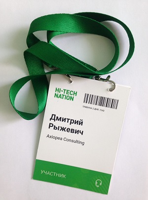
As usual with conferences, every participant has been supplied with a badge. Here’s a badge from the conference (not mine, but you get the idea):

In this post, I’d like to reason about how the conference badge could be made better. The goal is not to brag about the conference or its organizers. They did an excellent job by bringing together a great set of speakers. I just want to perform a thought experiment on how such a small part of the conference as badges can be made better.
What I like in this badge
Before thinking about improvements, let’s name things that are already good with the badge:
- Size of the badge—the size of the badge is 105 × 148 mm (4.13 × 5.83 inches). The badge doesn’t feel bulky, and it fits all the information.
- Color-coding of the badge—the color of a badge differs whether you are a participant, a speaker, or a staff member. It makes it easy to recognize the type of a person in a crowd. The badge color matches the lanyard color, which is a nice detail.
- Useful flip side—the flip side contains the agenda for two days of the conference. It proved to be very convenient.
What I would improve
1. Increase font size
Problem: the typeface used for the badge is Roboto from Google. I would guess that organizers used around 28 pt font size for the first and last name in bold, and about 18 pt for a company name. This is not enough to read a person’s name from the 2–3 meters distance. To make networking more effective, it should be easy to get a person’s name easily.
How to fix: I would set the font size for the first name to 34-36 pt. This way the badge would still have enough space for long names, but the first name would be much easier to read. The last name is less important, so I’d use normal weight instead of bold and, probably, set it to 2-4 pt smaller than the first name.
Take a look at the difference:
Дмитрий 28 pt
Дмитрий 36 pt
2. Make lanyard shorter
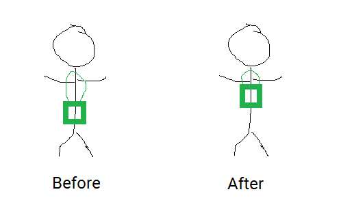
Problem: the length of the lanyard is about 90 cm. I’m about 175 cm high, which places the badge about 35 cm under my chin. To give that in perspective—my name on the badge would be around my bellybutton. Sum this with the small font size and that makes the info on a badge quite unreadable. Oh, and with length like this, the badge starts to swing when walking.
How to fix: Make lanyard 30 cm shorter. This would make the distance between a chin and a badge around 15–20 cm, which would be around chest level. This is much more comfortable to wear and to scan.

3. Do not use Roboto
Problem: Roboto is a great typeface for UI interfaces, but it doesn’t look that good in a large bold font on badges. And my personal opinion is that Roboto’s Cyrillic is not beautiful.
How to fix: Avoid bold font and go for a bigger font size with a normal weight instead. Or, even better, use another free font available from Google Fonts or elsewhere.
Дмитрий Roboto, bold, 28 pt
Дмитрий Roboto, normal, 30 pt
Дмитрий PT Sans, bold, 30 pt
Дмитрий Fira Sans, semibold, 30 pt
Next time you’ll be visiting a conference, I encourage you to look at your badge.
How can it be made better?