Should We Change HTML Defaults?
I want to talk a little about typography in Html.
Let’s take an example markup with some headings and a paragraph of text:
<h1>This is heading 1</h1>
<h2>This is heading 2</h2>
<h3>This is heading 3</h3>
<h4>This is heading 4</h4>
<h5>This is heading 5</h5>
<h6>This is heading 6</h6>

<p>
  <b>Tip:</b> Use h1 to h6 elements only for headings.
  Do not use them just to make text bold or big.
  Use other tags for that.
</p>
There are no default styles defined in the Html standard for heading and paragraph elements. In most modern browsers you will see this by default (default CSS settings are mentioned in HTML <h1> to <h6> Tags article on w3schools.com):
This is heading 1
This is heading 2
This is heading 3
This is heading 4
This is heading 5
This is heading 6
Tip: Use h1 to h6 elements only for headings. Do not use them just to make text bold or big. Use other tags for that.
Default settings
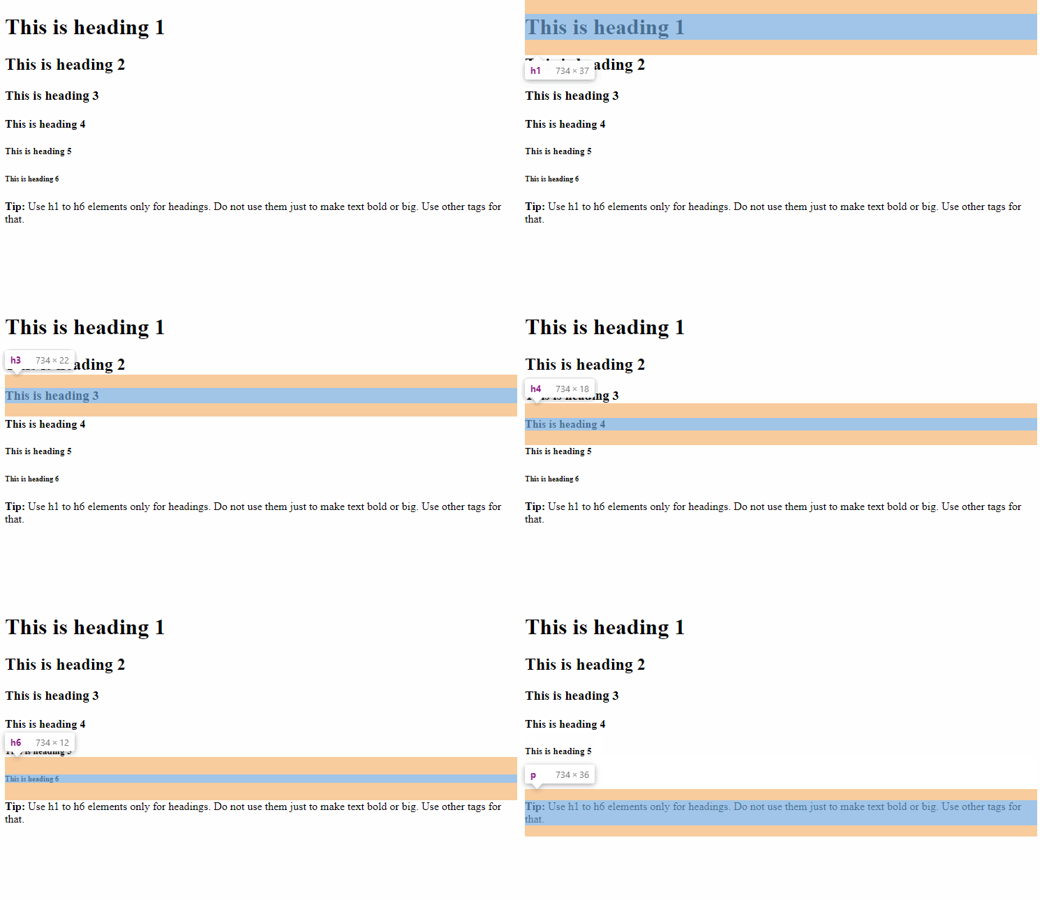
By default, browsers will add equal margins at the top and bottom of headings.
Here are margins highlighted for each element:

You may find such style in books, but it is rarely can be seen on the web. Let’s take a look at some examples.
Bootstrap CSS framework
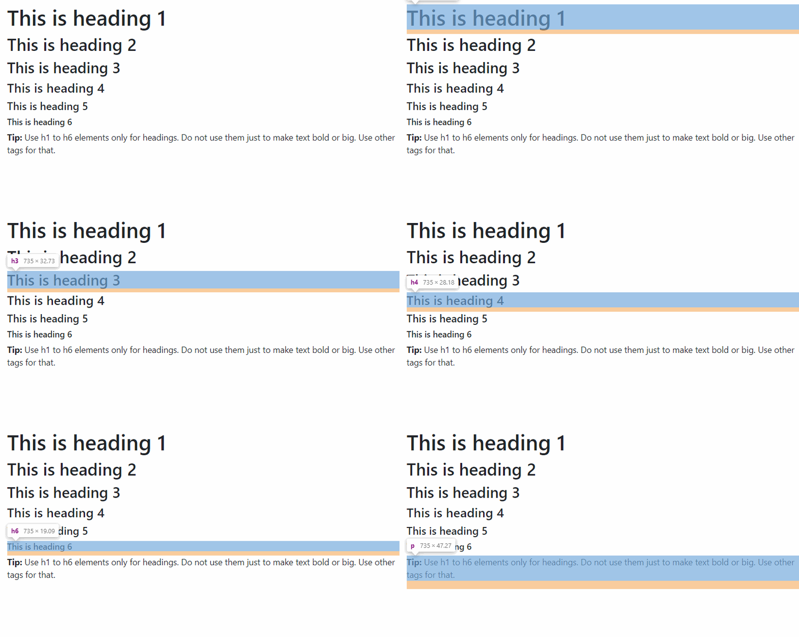
Bootstrap is a popular framework for building sites and applications. Default styles applied to headings and paragraphs by Bootstrap influence lots of sites. Font family, size, and other settings will differ from site to site, but the trend to remove top margin, a use equal bottom margin will stay:
h1, h2, h3, h4, h5, h6 {
  margin-top: 0;
  margin-bottom: 0.5rem;
}
Here are margins highlighted for a default Bootstrap css:

Apple developer site
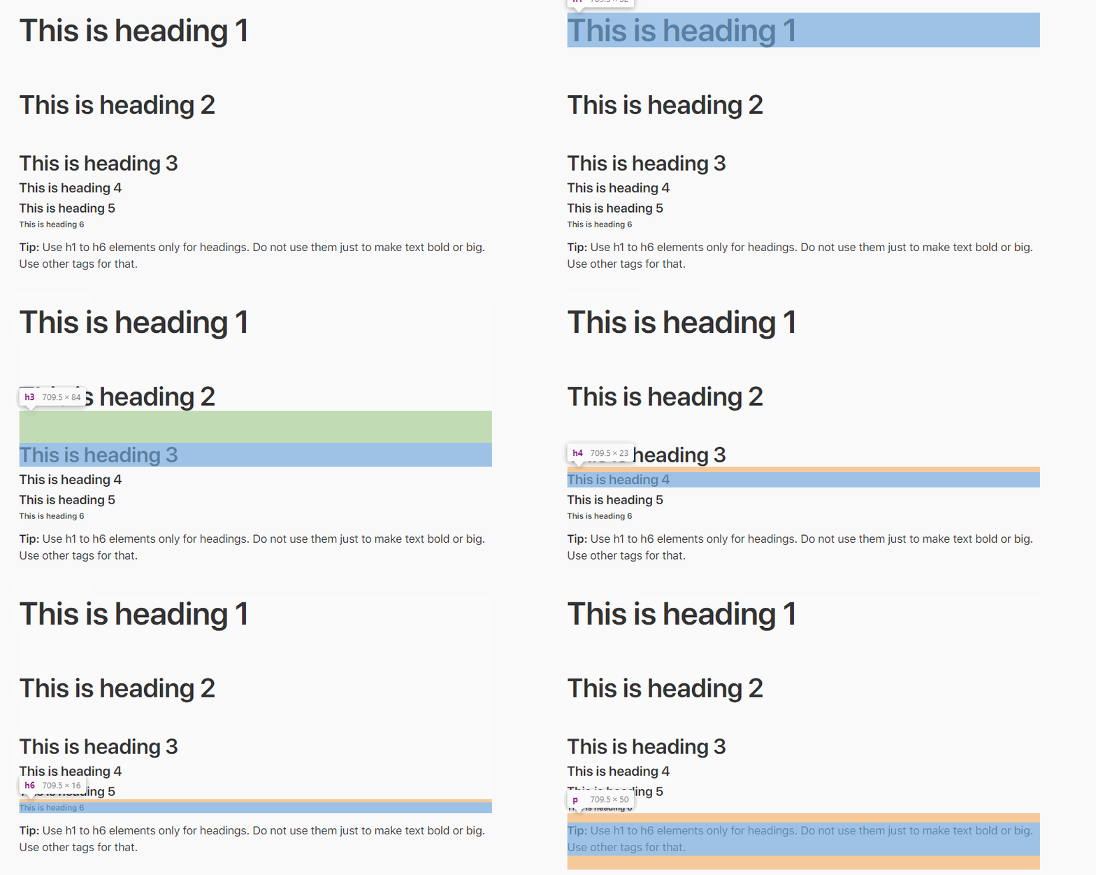
Here are styles from the Apple site for developers (paddings are highlighted in green):

Dropbox site
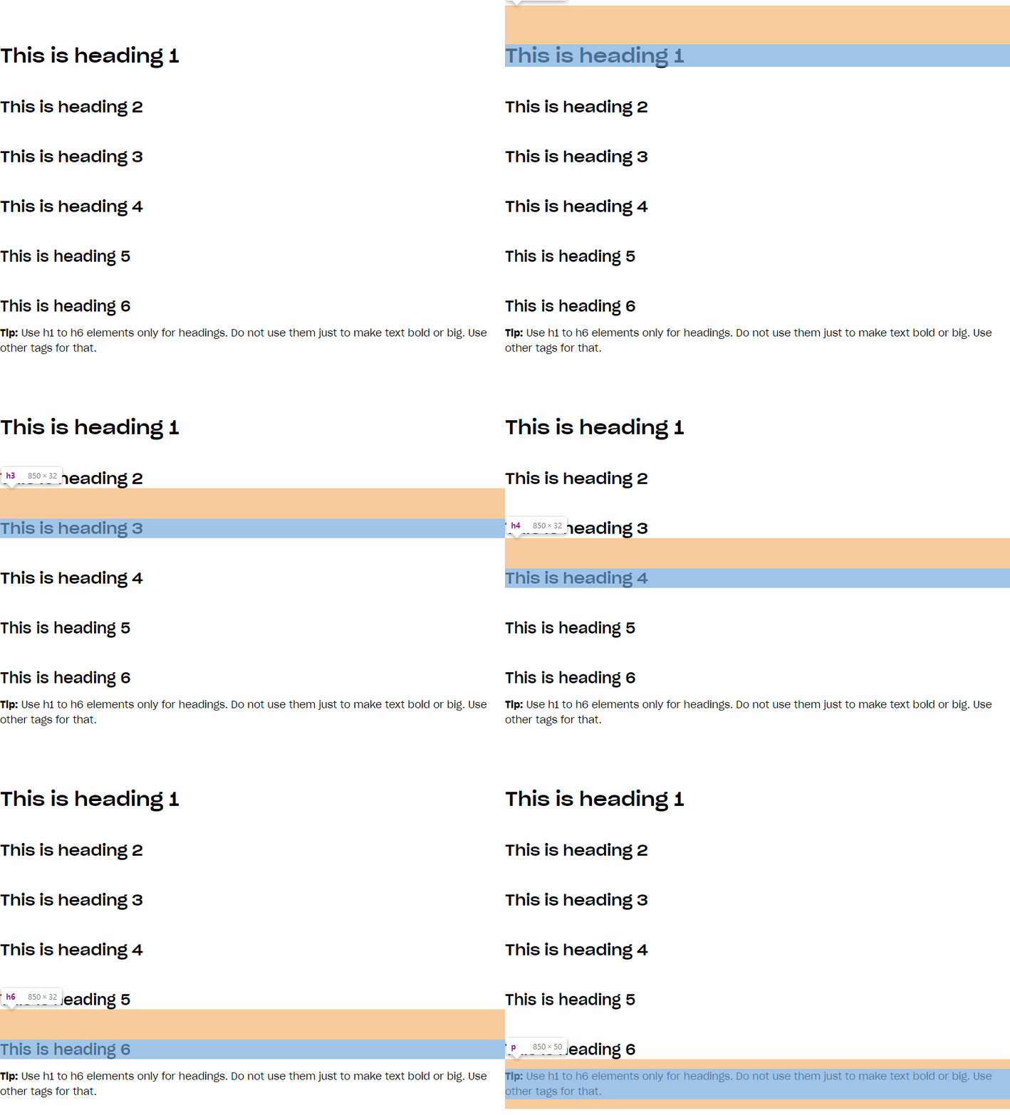
And one more example, this time from the Dropbox site:

Summary
In modern web sites, headings are usually outlined more either from the top or bottom, but not equally from both sides. This differs from the standard rendering of modern browsers, which follows a more traditional, book-like approach.