Video Web Part. Implementation Details
Note: This post is about the implementation details of the Video web part. If you are interested in a web part’s overview, check the Video Web Part post.
The Video web part allows to show videos in your SharePoint Online pages. The source code for the web part is available in the GitHub repository.
This web part illustrates the following concepts on top of the SharePoint Framework:
- Using React for building SharePoint Framework web parts.
- Support for a full-width section.
- Using Placeholder reusable control from @pnp/spfx-controls-react.
- Using Office UI Fabric for responsive layout.
- Using React functional components and higher order components (HOC).
Rendering video
The main logic for the Video web part is located in the src/webparts/video/components/Video.tsx component.
When rendering what
Depending on whether we are editing web part and whether a video to a link has been provided, there are four possible outcomes:
- If we are editing the web part and a video link is not specified — render a Placeholder control from the @pnp/spfx-controls-react package. The Placeholder will ask to specify a video link.
- If we are editing the web part and a video link is specified — render a video player using the link to a video. An additional link to navigate to will be ignored while editing web part.
- If we are showing the web part (i.e. not editing) and a video link is not specified — show empty web part.
- If we are showing the web part and a video link is specified — show a video player. An additional link to navigate to, dimming filter and a text over a video will be added if it has been specified in properties. This is the main scenario for end users.
As this component is very simple and does depend on a React lifecycle, it was converted from class to a function. In React this type of components is called functional components as opposed to class components that derive from the React.Component class. The function returns what needs to be rendered in the same way as the render() function of a class component.
Conditional wrapper
If a navigation link has been specified in web part properties, we need to wrap a video with an <a> tag. If we are editing web part or a link has not been provided, we need to wrap a video in <div> tag. This can be achieved with additional if statements, but this will lead to code duplication (multiple branches described above that differ in a wrappwer — either <a> or <div>).
To avoid duplication, there is an additional component that renders either <a> or <div> depending on a specified condition. This is a ConditionalLinkWrapper.tsx component.
Here’s how it is used by Video.tsx component:
const videoContainer =
(<ConditionalLinkWrapper
    condition={link && !isEditing}
    link={link}
    className={styles.videoContainer}
 >
    <div className={css(styles.dimmingFilter, addFilter ? '' : styles.hidden)}></div>
        <video autoPlay loop muted playsinline src={videoLink} poster={posterLink}></video>
        <div className={css(styles.textContainer, addTextOver ? '' : styles.hidden)}>
        <div className={styles.overlayTextContainer}>
            <div className={styles.overlayText}>
                {escape(title)}
            </div>
        </div>
    </div>
</ConditionalLinkWrapper>);
This component rendering depends on the link && !isEditing condition, where link is a link to a video and isEditing specifies whether we are currently editing a page.
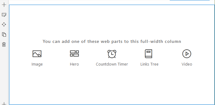
Full-width section support
The Video web part can be added to a full-width section:
The support for a full-width is specified in the VideoWebPart.manifest.json manifest file with the supportsFullBleed parameter set to true:
"supportsFullBleed": true,Responsive layout
The size of a text over a video depends on a screen resolution. This is done using Office UI Fabric mixins in the Video.module.scss file. @include ms-screen-xl-up mixin is used to define rules for larger screens (1024px and up):
@import '~office-ui-fabric-react/dist/sass/References.scss';

// some code removed for brevity
.textContainer {
  margin: 16px;

  @include ms-screen-xl-up {
    margin: 32px;
  }

  .overlayTextContainer {
    .overlayText {
      font-size: 20px;
      padding: 8px 16px;
      line-height: 30px;

      @include ms-screen-xl-up {
        font-size: 28px;
        padding: 18px 24px;
        line-height: 42px;
      }
    }
  }
}
If you want to learn more about responsive layouts with Office UI Fabric, check the Hiding SPFx Web Part on Small Screens article.