Common Issue When Using Office UI Fabric in SPFx Projects
There is one common problem when using Office UI Fabric in SPFx that you can find in lots of projects. This problem is using global class names in SPFx web parts and React components.
Here’s an excerpt from the Using Office UI Fabric Core and Fabric React in SharePoint Framework article:
To achieve reliability, one of the main problems we need to solve is that of Global CSS styles. This accounts to not using global class names in the HTML markup and instead using Fabric Core mixins and variables in the Sass declaration file. This involves importing the Fabric Core’s Sass declarations in your Sass file and then consuming the variables and mixins appropriately.
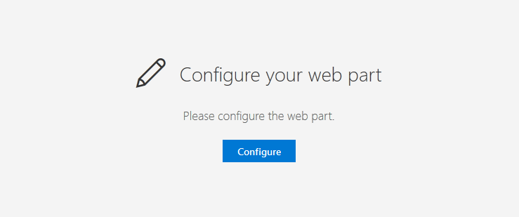
Let’s look at an example. The Placeholder control from the @pnp/spfx-controls-react package of reusable React controls.
When rendering, this control references global CSS styles ms-fontSize-su and ms-Icon classes. At the same time, the @pnp/spfx-controls-react package does not include the fabric.css file with these styles:
className={`${styles.placeholderIcon} ms-fontSize-su ms-Icon`} />Here is the same Placeholder control when a current page loads Office UI Fabric classes and not (note the size of the icon and title):

The proper way to add styles is to use mixins in the PlaceholderComponent.module.scss file:
.placeholderText {

  @include ms-fontWeight-light;
  @include ms-fontSize-xxl;

}
This way the component will contain all the CSS code it needs without external dependencies.
Check out the Using Office UI Fabric Core and Fabric React in SharePoint Framework article to learn more about using Office UI Fabric styles in SPFx projects.