Is Your Brand Color OK for SharePoint?
You can use your color brand as a theme color for the SharePoint Online intranet. This is a great way to make your intranet recognized as a credible source of information in the company.
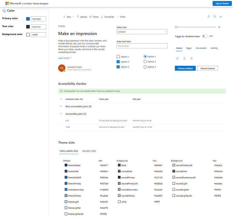
Before you apply your brand color to your intranet, you need to make sure that the color will work well with SharePoint Online. The easiest way to do that is to use the UI Fabric Theme Designer. It is an online tool from Microsoft that allows you to check your brand color and generate a SharePoint theme that you can apply to your intranet.
How to check your brand color
To check your brand color with the tool, you need to specify the color as the Primary color. You can leave default values for the text color (#323130) and the background color (#ffffff).
For example, let’s take the Shell company. Here’s their logo:

The “red” color the brand using is #ED1C24
Let’s apply this color as the primary color in the UI Fabric Theme Designer:
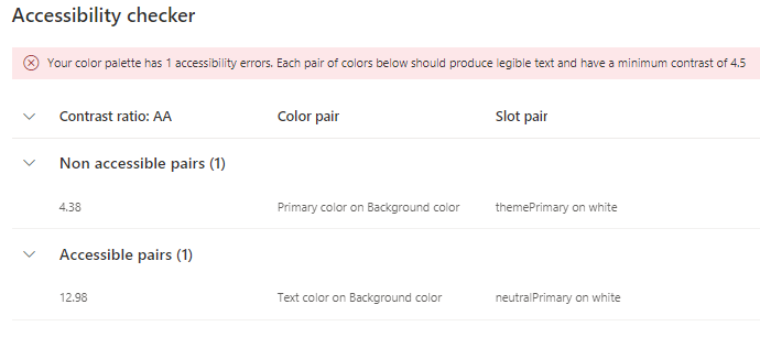
The tool will show that there’s a contrast problem when the primary color is displayed on top of the background color. Here’s an example when the text will be hard to read because of the bad contrast:

To fix that we can make a contrast stronger. The currently calculated contrast is 4.38 and a minimum of 4.5 is recommended. One way to achieve the right contrast is to look at the #ED1C24 in HSV (hue-saturation-value) and decrease the value of the color:
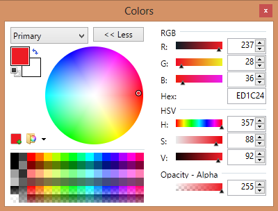
The original color #ED1C24 has got value of 92. Here’s the #D81A23 color that has got the value of 85 .
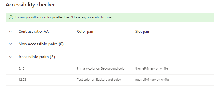
The modified color is darker and provides better contrast. This color passes the accessibility checker:
Now you can use the Export theme button at the top of the tool to generate a SharePoint Online theme that can be applied to your intranet.