Do Not Rely on SharePoint When Using Office UI Fabric
A quick note on a default availability of Office UI Fabric CSS in SharePoint Online: it is not consistent and it is not documented properly.
You should not rely on any current behavior of your SharePoint Online environment. It may change in the future without any notice.
The problem with SharePoint Online is that your code may work properly when you’re using global Office UI Fabric CSS classes without loading them. Or it may NOT work.
It depends on whether your current SharePoint Online environment loads Office UI Fabric CSS styles. This behavior changes from one environment to another, and it also changes with time.
I’ve already written about the problem with global CSS classes from Office UI Fabric when using them directly in SharePoint Framework solutions. The short version is to not use global Office UI Fabric CSS classes in your markup and use SASS mixins instead.
Let’s consider an example React component, that should render two divs on a single row using Office UI Fabric layout classes (e.g. “ms-Grid”, “ms-Grid-col”, “ms-lg4”):
return (
<div className={styles.helloWorld}>
  <div className="ms-Grid">
    <div className="ms-Grid-row">
      <div className="ms-Grid-col ms-lg4">
        <div className={styles.demoBlock}>A</div>
      </div>
      <div className="ms-Grid-col ms-lg8">
        <div className={styles.demoBlock}>B</div>
      </div>
    </div>
  </div>
</div>
);
Here’s how the web part renders in a SharePoint Online workbench (i.e. available with /_layouts/15/workbench.aspx):
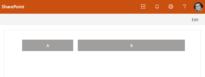
The layout works fine as SharePoint Online loads Office UI Fabric CSS under the hood. But this beharivor may change without a notice and relying on this may break your solution in the future!
Here’s how it looks like in a local workbench:
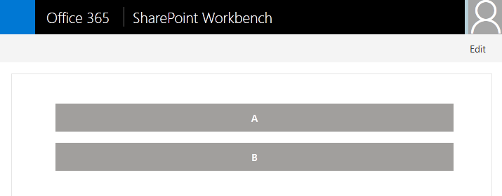
The layout is broken — divs are displayed in two separate rows one under another. That happens because the local workbench does not load Office UI Fabric classes, so the browser knows nothing about those.
The right way
The right way to use Office UI Fabric classes is to use mixins:
return (
<div className={styles.helloWorld}>
  <div className={styles.grid}>
    <div className={styles.gridRow}>
    <div className={styles.smallColumn}>
      <div className={styles.demoBlock}>A</div>
    </div>
    <div className={styles.largeColumn}>
      <div className={styles.demoBlock}>B</div>
    </div>
    </div>
  </div>
</div>
);
The CSS styles would look like that:
@import '~office-ui-fabric-react/dist/sass/References.scss';

.helloWorld {
  .grid {
    @include ms-Grid;
  }

  .gridRow {
    @include ms-Grid-row;
  }

  .smallColumn {
    @include ms-Grid-col;
    @include ms-lg4;
  }

  .largeColumn {
    @include ms-Grid-col;
    @include ms-lg8;
  }
}
This is the only correct way to do styling with Office UI Fabric. At least until the SharePoint Online behavior is not properly documented.